Branding Digital Design Systems
A voice of their own
Role 〰️ Lead Designer
Client 〰️ Google Partners
Region 〰️ Global
After years of defaulting to the high level Google brand, Partners needed it’s own style set by a new brand standard
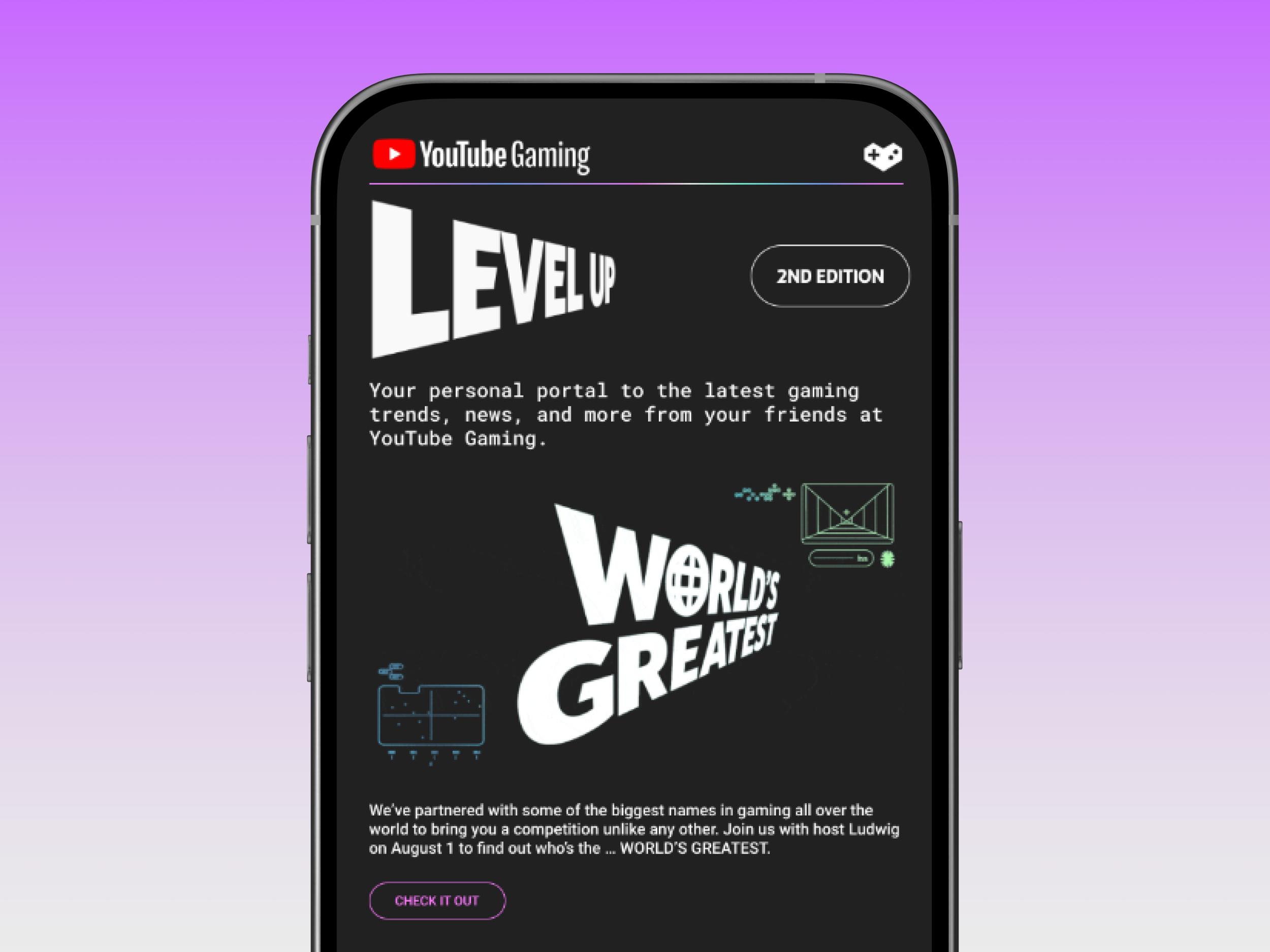
Goal 〰️ Update the minimal brand standard into a fully fleshed out brand that addressed global consistency and scaled quickly for events regardless of marketing materials such as photography and local branding.

Each market and Google Partners event, program or communication was handled by multiple teams. With no style guide they defaulted to anything that worked under the core Google brand.


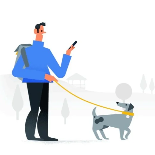
By borrowing from the Google brand core colors and iconography we were able to focus in on all of the other ways this brand could flex.
✦ Won an ongoing agency partnership to execute branding for following years
✦ Immediate adoption due to easy to use marketing kit
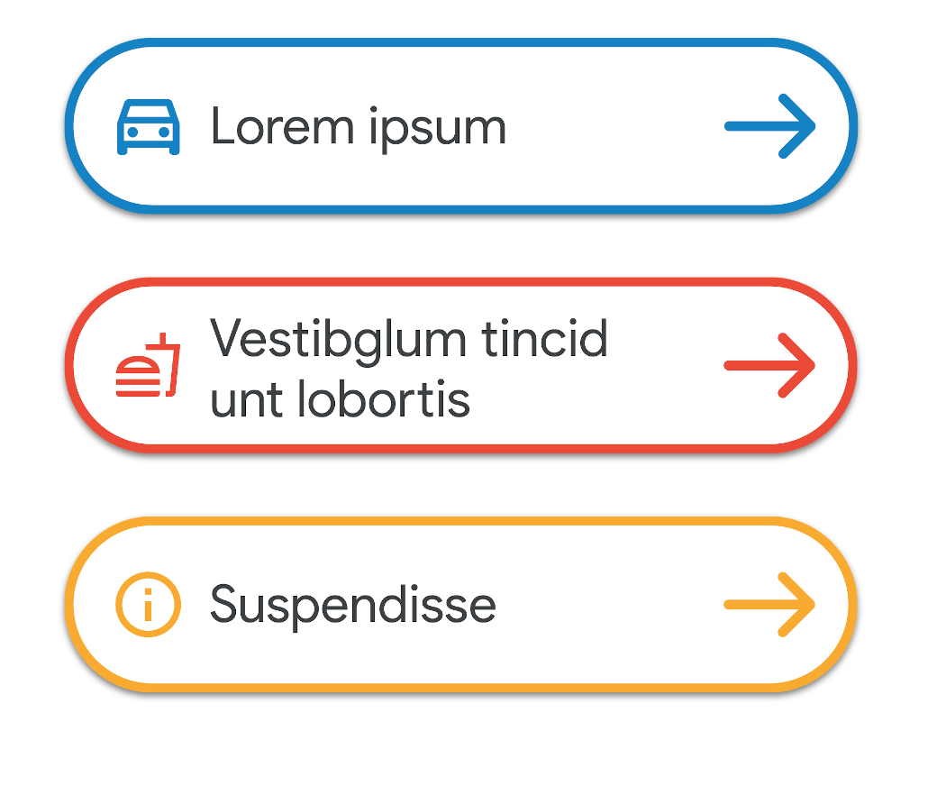
Solution 〰️ By representing the branding through links of partnership and a simple grid the design became an easy modular system with great flexibility for many markets, use cases and skill level of design. The marketing kit created was easy to adopt with many basic templates for teams to pick up immediately, and gave a huge variety of options to ensure design didn’t become stale.